Reisang & Buria
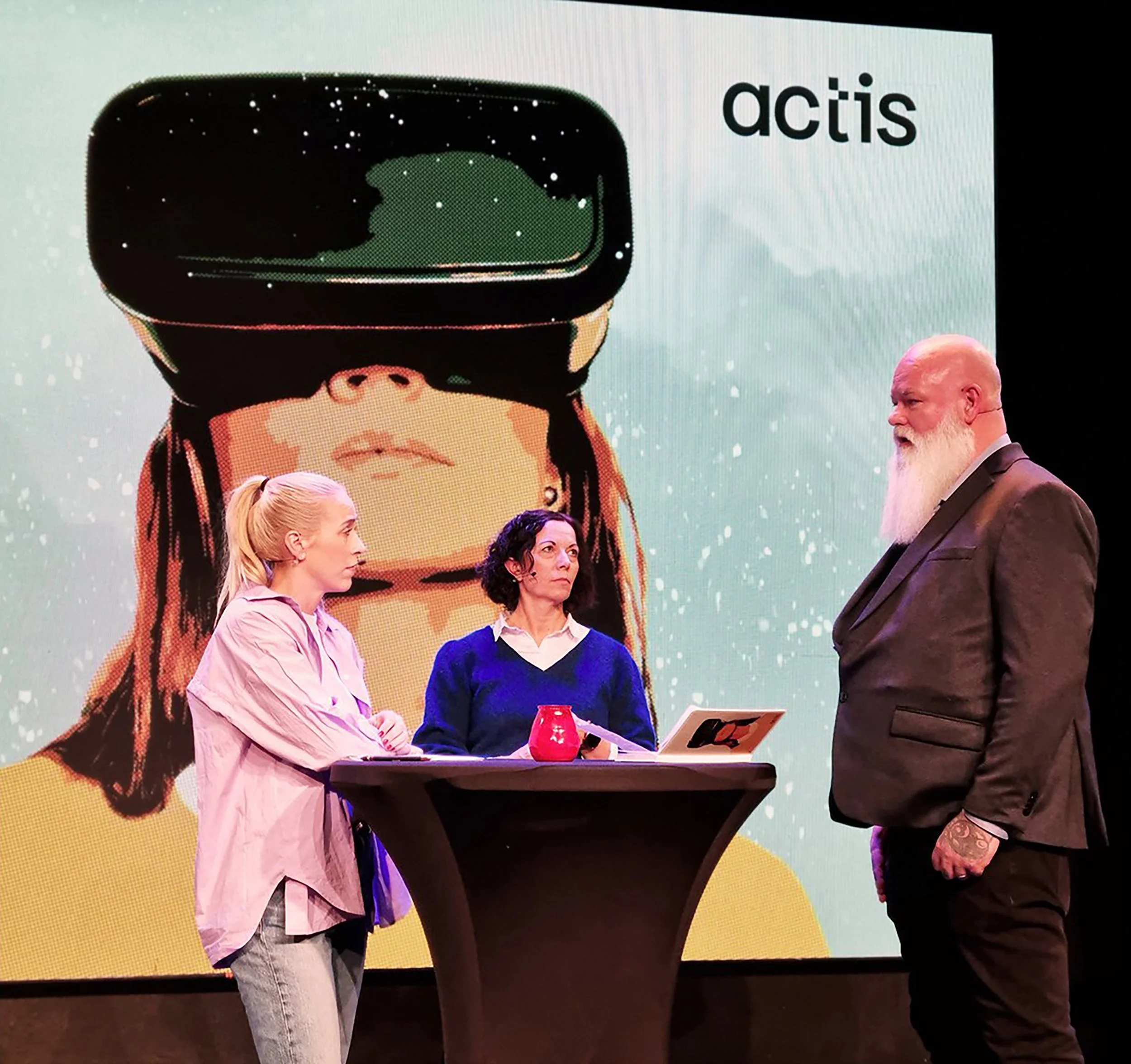
Visuals for Actis
We created the visuals for the Actis conference, which were used across social media, stage backdrops, and digital and printed materials.

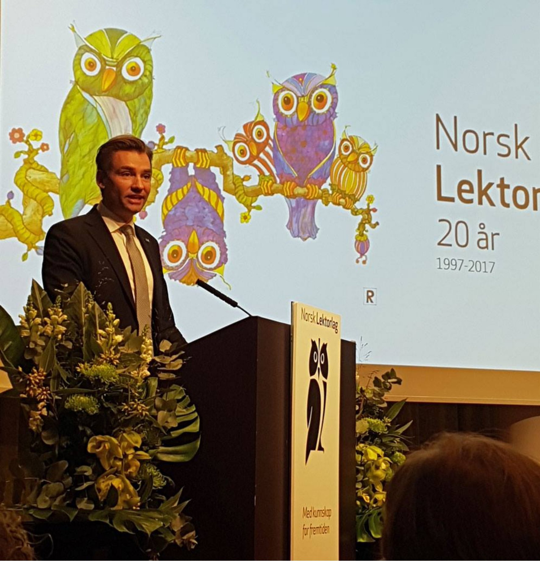
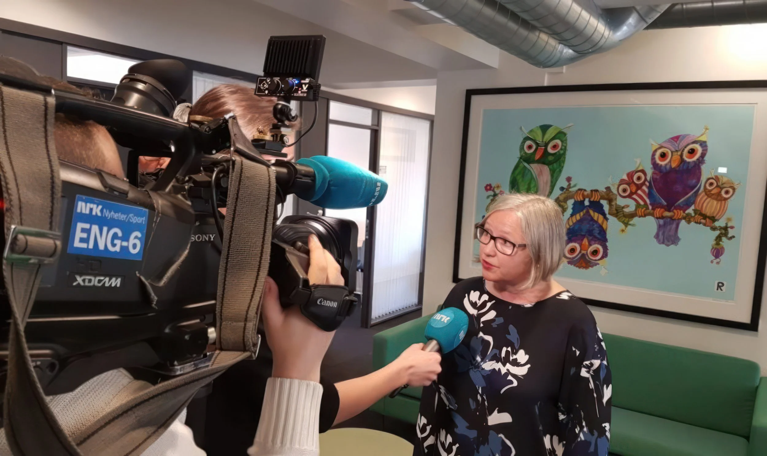
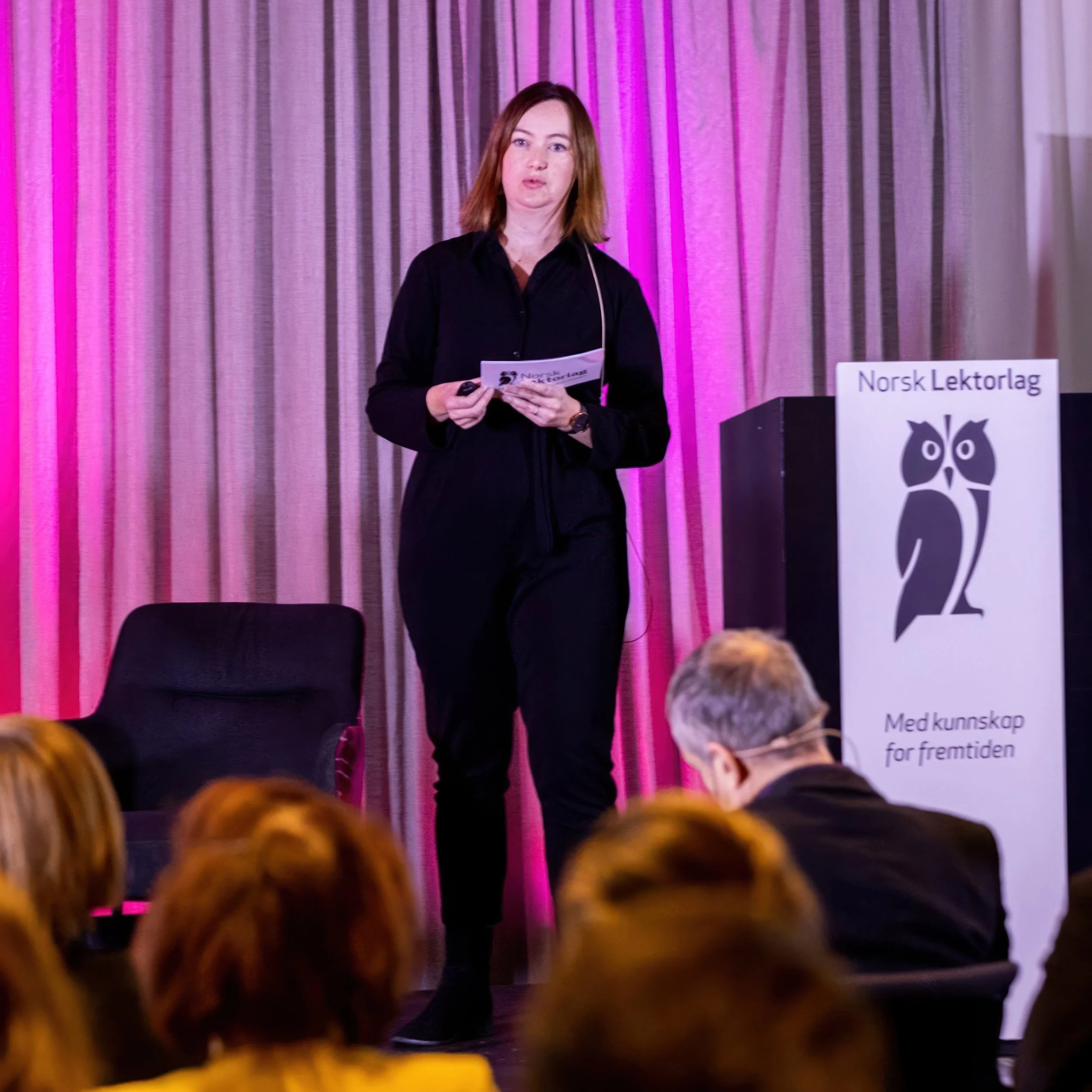
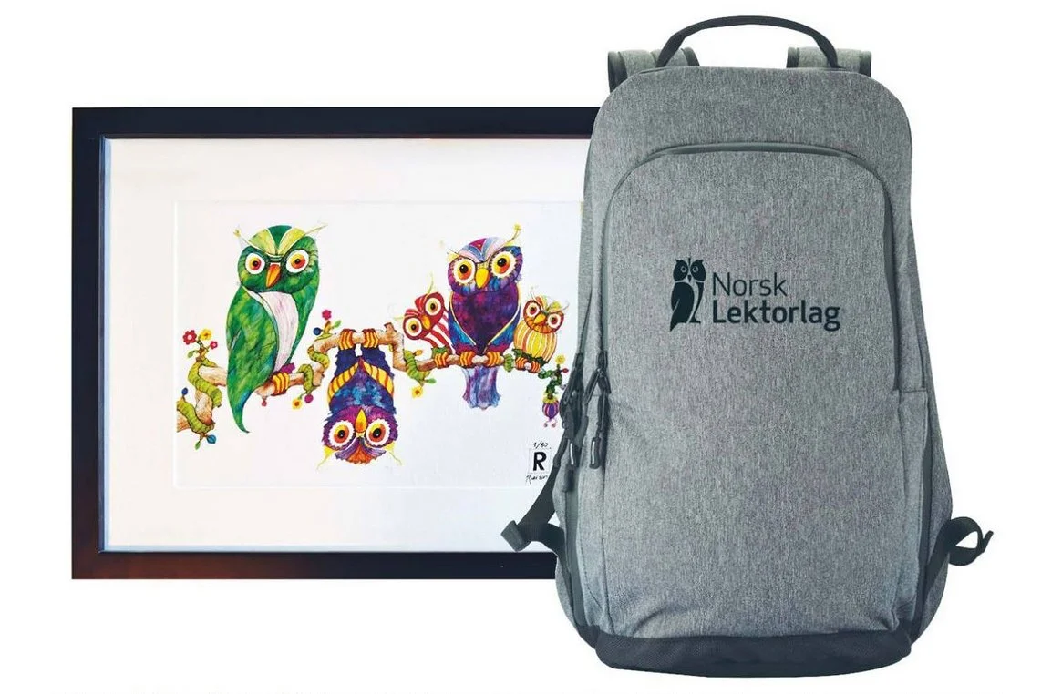
Norsk Lektorlag
Back when Rita Helgesen led Norsk Lektorlag (the Norwegian Lecturers Association), we created an artwork inspired by their original owl logo, where a group of owls greets everyone who enters their head office.
We also modernized and vectorized their original logo, ensuring the iconic “teacher’s gaze" remained intact.
We also made a limited edition of smaller-format signed and numbered pigment prints for Lektorlaget.
Norwegian Hydropower
Cover illustration for the Norwegian magazine Samfunn og Økonomi – Power and Hydropower.
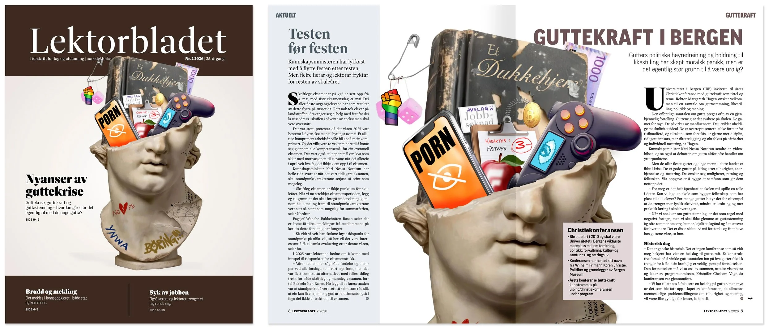
A Boy Crisis?
Multi-use cover illustration for the Norwegian Lectors’ Association. The central topic was boys’ challenges and whether there really is a "boy crisis" — offering a more nuanced view of the debate.
Aftenposten’s Summer Classics
Four portraits with matching spot illustrations created for Aftenposten’s Summer Classics series.
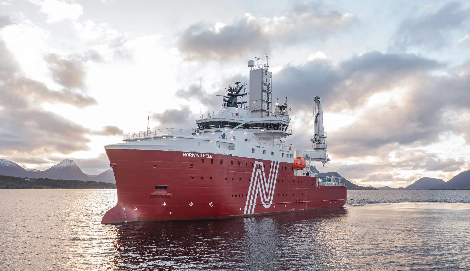
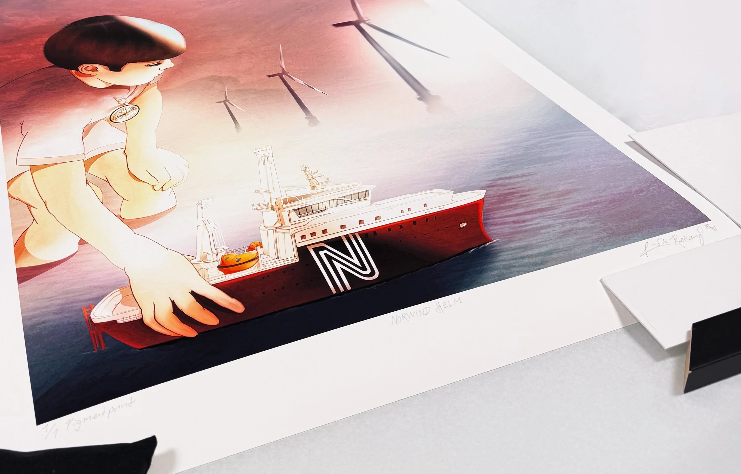
Norwind Helm
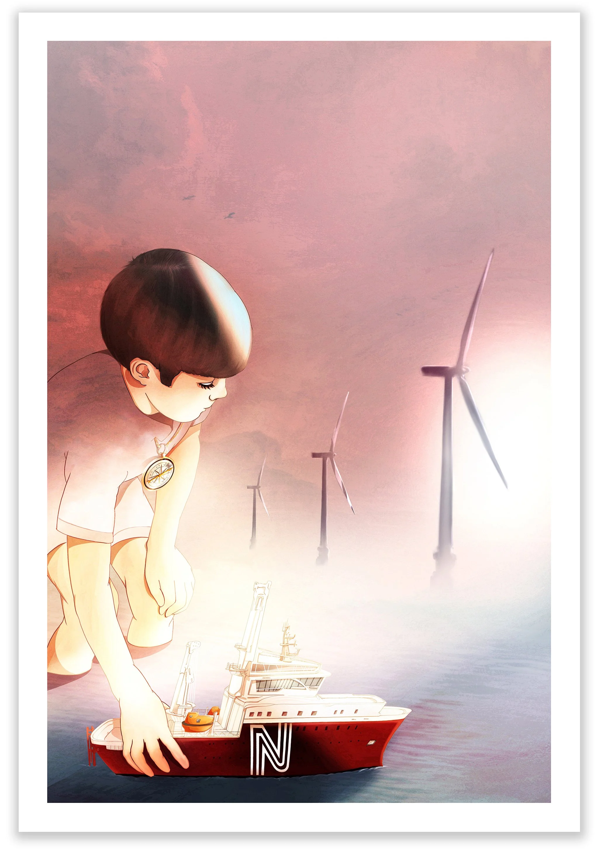
We created a dåpsgave (artwork for the launch) for Norwind Offshore Wind’s new CSOV Norwind Helm — a specialized vessel for the wind industry — as a unique 1/1 signed pigment print (50 × 70 cm).
Despite a very tight deadline, we tailored the artwork to the client’s wishes — and with DHL Express from Berlin (24-hour delivery to most destinations), it arrived in good time to be framed and presented before the ship entered the water.
Body and Boundaries
Kindergarten Conversation Cards
“The earlier children get words and concepts for what violence and abuse really are, the more likely they are to tell someone – so it can be stopped.”
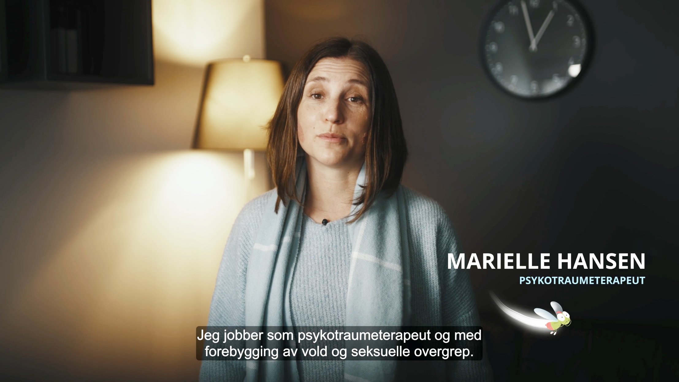
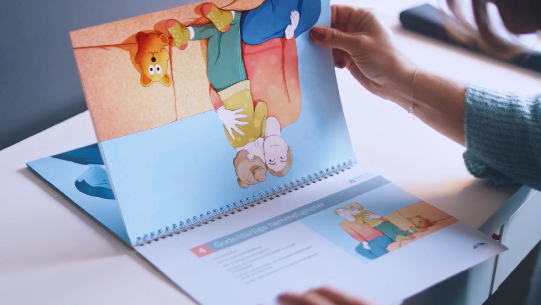

In collaboration with PBL (Private Kindergarten Association of Norway), we developed 12 illustrations for their kindergarten resource “Conversation Cards: Body and Boundaries”.
The cards serve as a safe pedagogical framework that enables kindergarten teachers to speak with children about the body and address the difficult topics of violence and sexual abuse in an informative and non-frightening way.
Hot Water Training
Multi-use cover commission for R-magasinet (Norwegian Rheumatism Association) – Hot water training for rheumatism.
Ungdomsløftet
Double-page illustration for Yrke Magazine – on Norwegian Prime Minister Støre’s promised Ungdomsløftet (youth boost), where practical school subjects and “no-smartphone rules” aim to address a school system showing signs of deeper challenges.
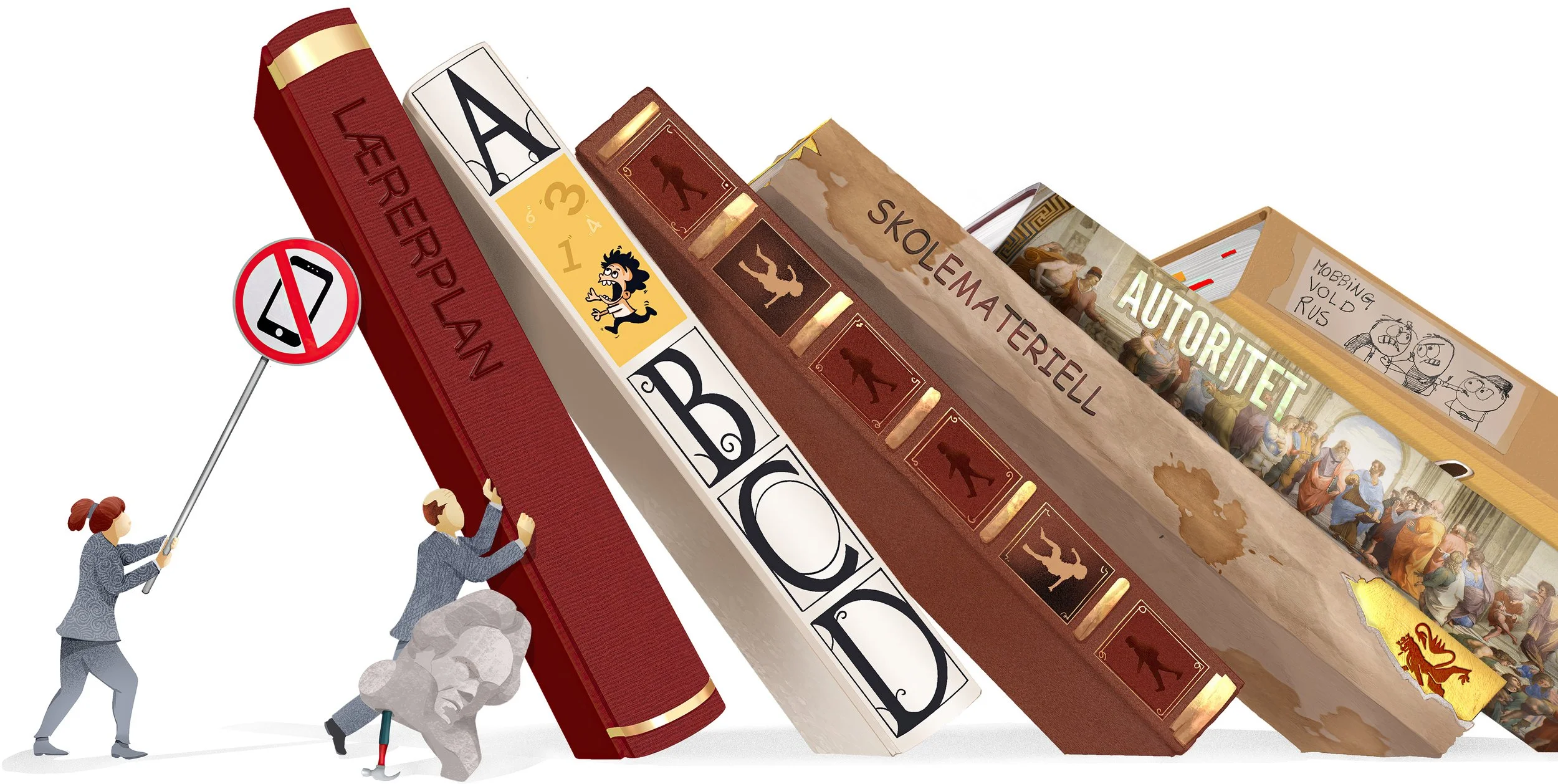
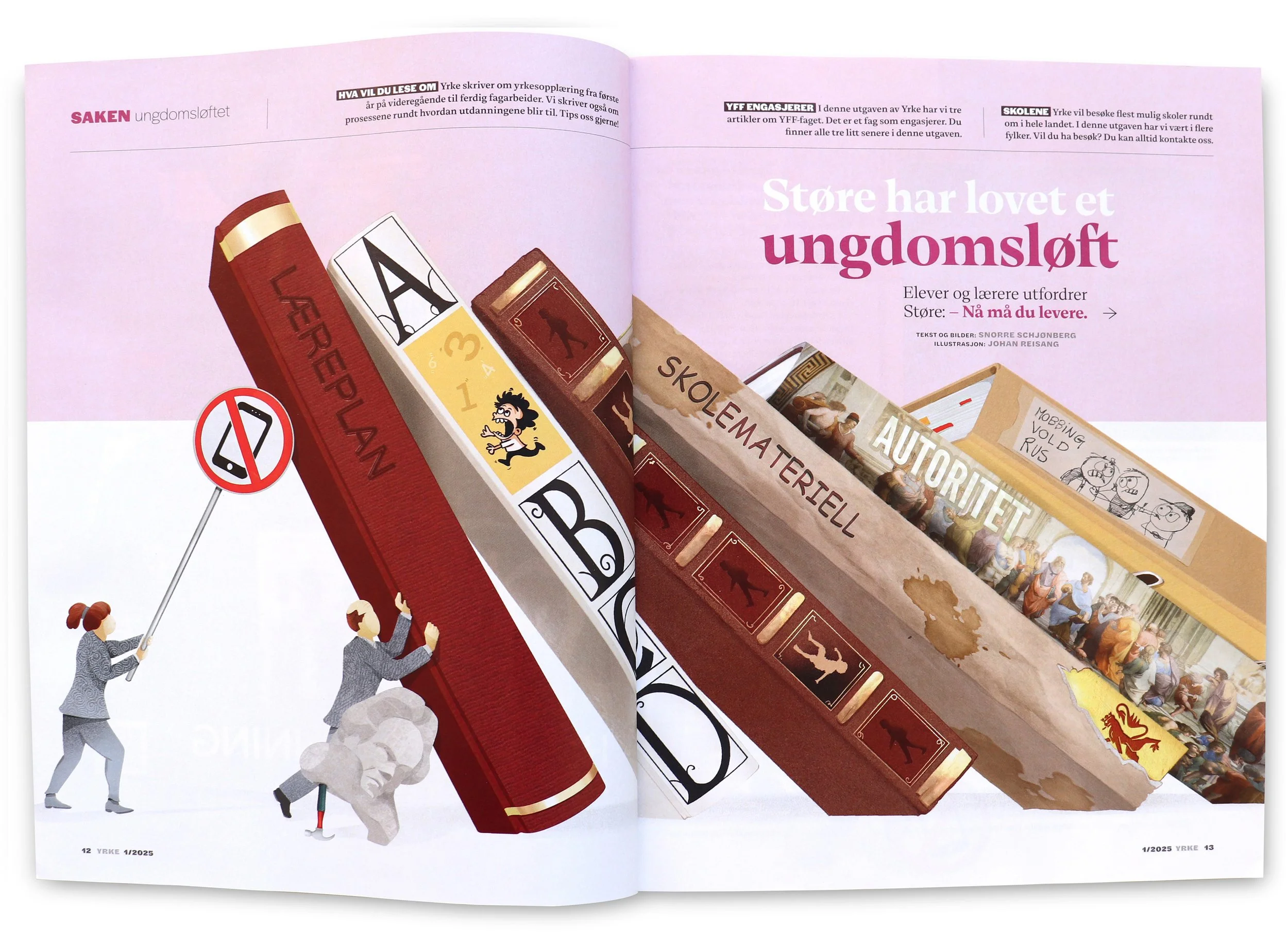


Multi-use illustration: A single double-page commission ultimately delivered reusable elements for a 9-page feature, effectively stretching one commission across an entire story.
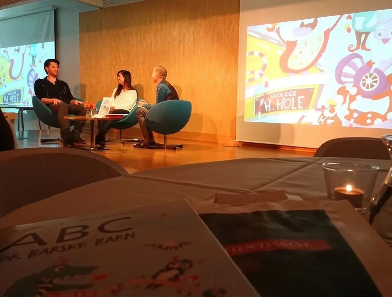
11th edition of “ABC for barske barn"
Our ABC book with Anne Østgaard – now in its 11th edition, 25,200 copies printed and counting!
We created the complete visual world: 29 full-page illustrations (one per letter), countless spot illustrations, full book design — plus a matching colouring workbook.
The ABC “word hunt” concept: every page is packed with Norwegian words starting with its letter. A wild and colorful way for kids and adults to explore the alphabet together.